Charting
Overview
Another functionality available from Table Result is charting that can be invoked from the main toolbar or from the pop-up menu:
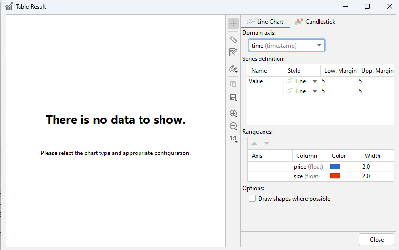
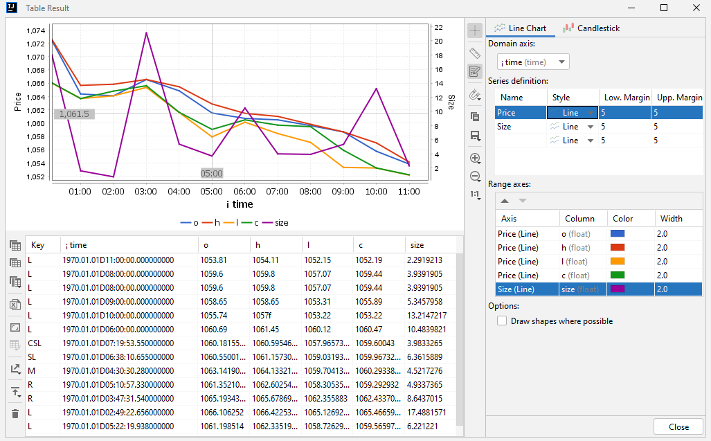
Charting is shown in separate windows and has own configuration and toolbars:
Charts
Line Chart
There are four main parts of any Line Charting:
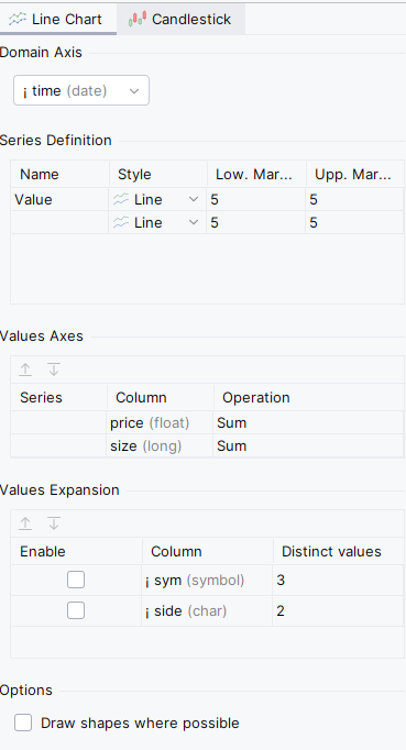
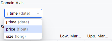
Domain axis
The ‘X’ range of the chart. Any temporal or numerical column can be used as the Domain.
Series definition
Each series has a separate range on Y axis.
Usually you need only one, but if you have price and size series with differed Y range, you can use differ series to show differ ranges on the same chart.
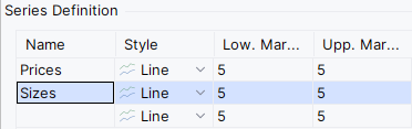
Start typing into the empty ‘Name’ box to create a new Series or change the name of exist one:
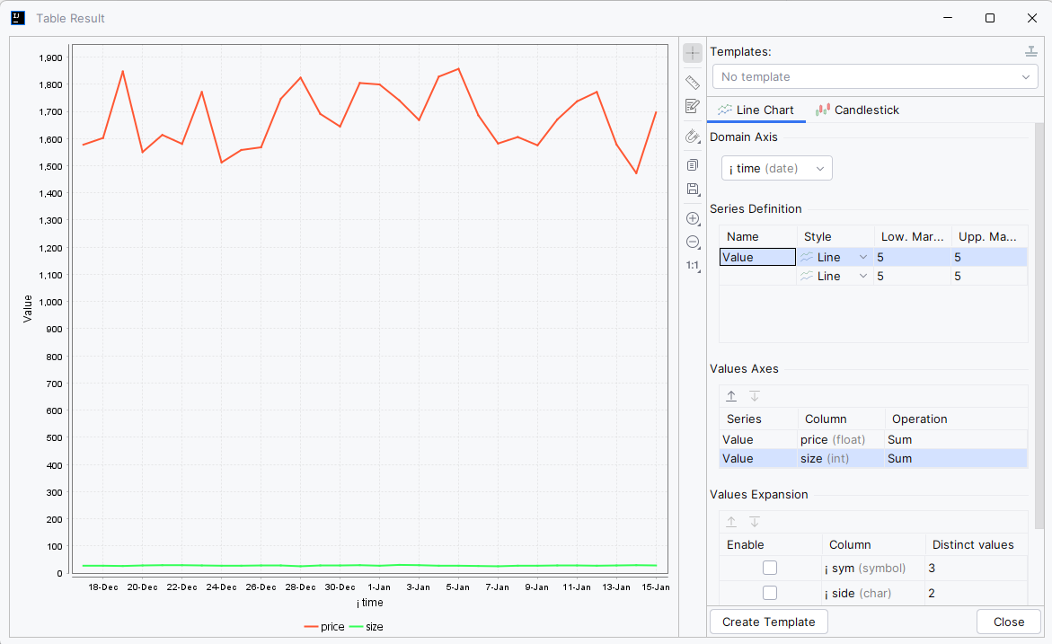
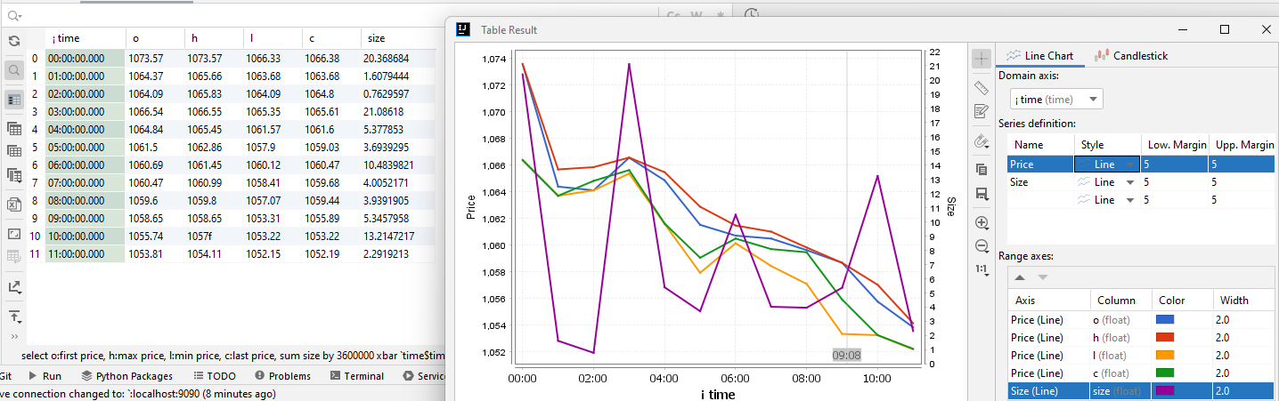
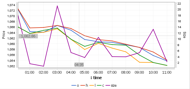
There is a sample of wrong price/size charting when both values are shown in the same Series:
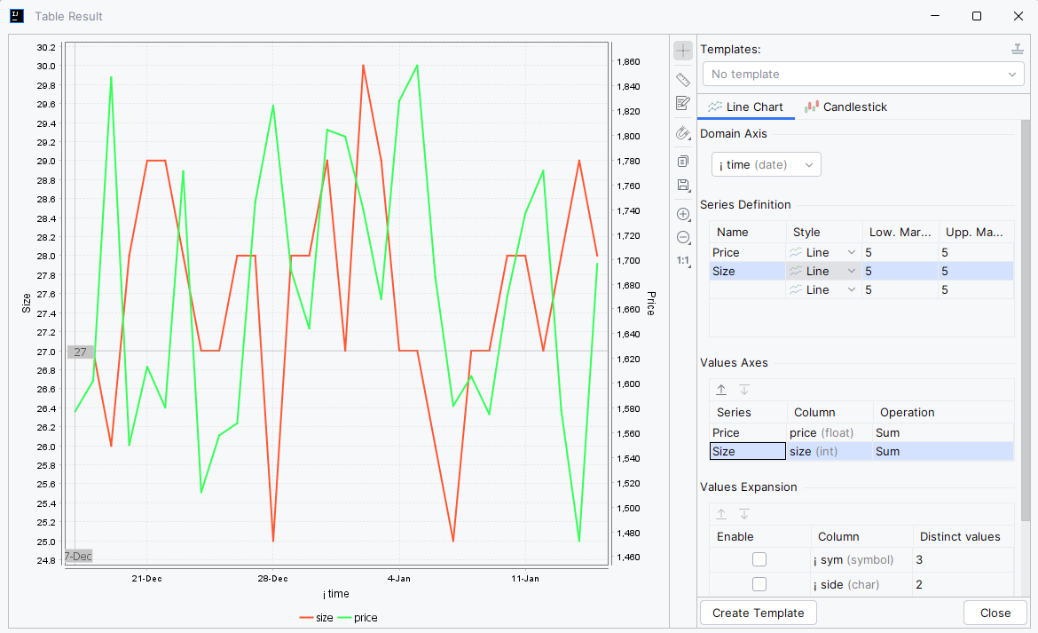
Moving prices and sizes into dedicated Series resolves the issue and creates own axis for each data range:
Values Axes
To show the value on the chart, select the appropriate Series which the value belongs to add it into the chart.
Values Expansion
Sometimes you need to expand your data by another column, like side or instrument. Instead of regenerating the whole dataset, you can use the Values Expansion section.
Any symbol, char or string column can be used to expand the original data, but please pay attention to the number of Distinct Values for each as each expansion will increase the number of lines by Distinct Values times.
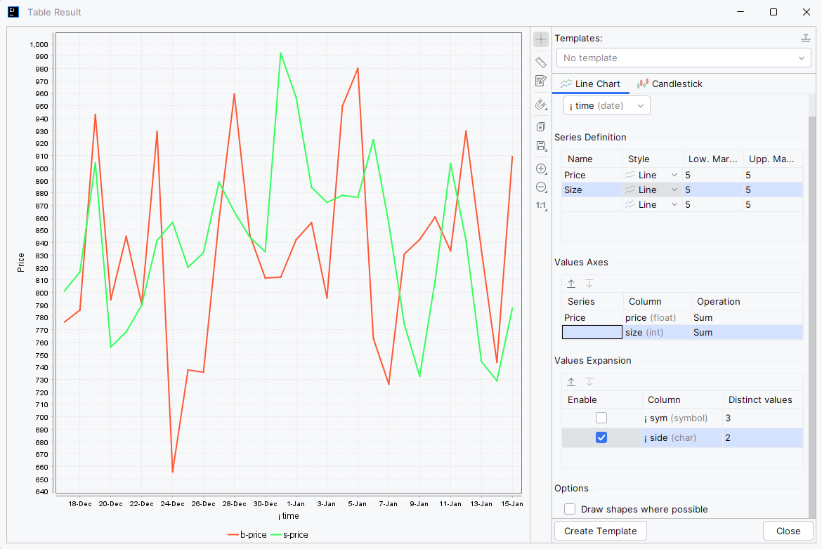
The following example shows how to draw prices by the side (bid and ask) at the same chart:
Charting style
You can change the style of each line by clicking on the legend title:
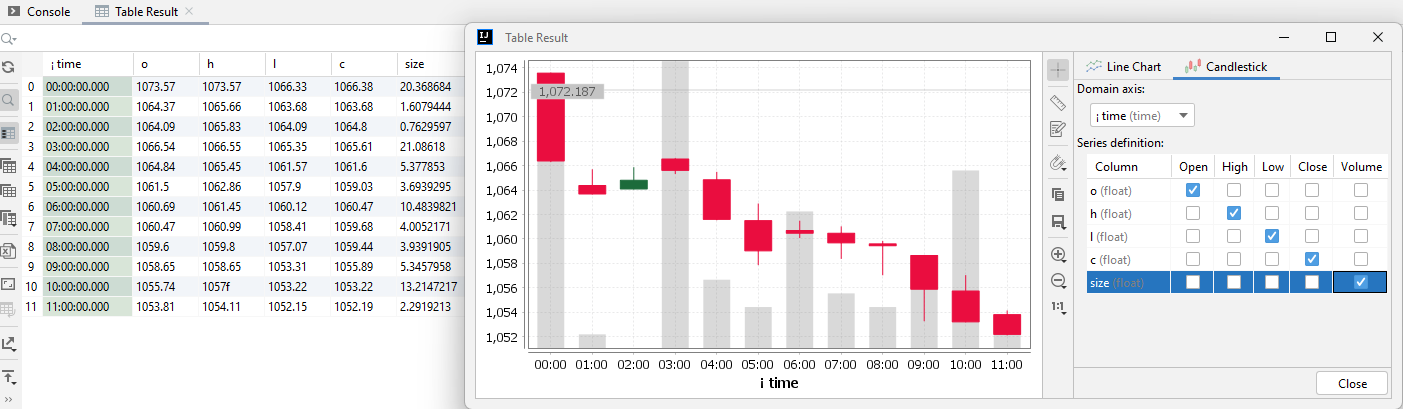
Candlestick Chart
The primary proposal of Candlestick Chart is to describe movements of prices.
It is similar to a bar chart in that each candlestick represents all four important pieces of information for that day: open and close in the thick body; high and low in the “candle wick”.
For example, you can create a candlestick data source for trades base as:
select o:first price, h:max price, l:min price, c:last price, sum size by 3600000 xbar `time$time from trade
We can build candlestick like:
Of course, the same data can be shown as a line chart, but it’s much less informative:
Interaction
You can use the left mouse button drag to move the chart inside the frame.
You can use the right mouse button drag to zoom an area of a chart.
Templates
Overview
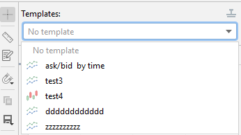
Chart Templates functionality allows you to create a template based on the current chart and simple select the template for the same dataset to draw a chart.
A Chart Template identifies a set of columns and other chart settings. You can apply a template only to a dataset with that contains all columns required by the template. Templates which can’t be applied to current dataset are not shown in the combobox and available only in Templates Manager.
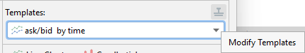
You can select a template for a dataset from combobox element in Chart Dialog in the top right corner:
Creating Template
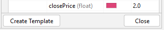
You can create a new template for a valid chart with ‘Create Template’ button located in the right bottom corner of chart’s configuration panel:
The button is disabled of the chart configuration is not correct.
When a template is already selected, the button is changed to ‘Update Template’ and updates active template instead of creating a new one.
You can create a new template based on already defined by selecting based templated in the Templates combobox and when selecting ‘No template’ value. When ‘No Template’ is selected, current configuration is not retested and can be used for new template.
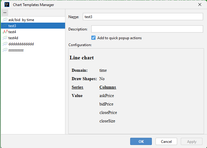
Templates Manager
You can view and remove exist templates with Templates Manager that can be invoked from the Chart Dialog:
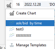
or from Table Result pop-up menu:
In the Templates Manager you can rename or change the description of any template as well as check its configuration. You can also permanently remove any template or hide it from quick popup actions:
Quick Actions
When ‘quick popup actions’ is enabled for a template at creation time or later in the Templates Manager, the appropriate template will be shown in the quick popup menu shown in Table Result:
Selecting the template will create a new Chart Dialog based on the template.
Charting Tools
Crosshair
When enabled (enabled by default), shows crosshair with X and Y coordinates:
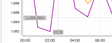
Measures
When enabled, allows to measure distance from one point to another point on the chart.
Click one point on the chart and then click another point (don’t drag as dragging move the chart itself) on the chart:
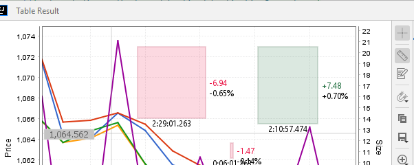
Moving mouse down creates negative/red measure. Moving mouse up creates positive/green measure.
Use right-click to remove some or all measures from the chart.
Points Collector
When enabled, writes each mouse click on the chart into the table that can be exported to Excel, copied and sent to an KDB instance:
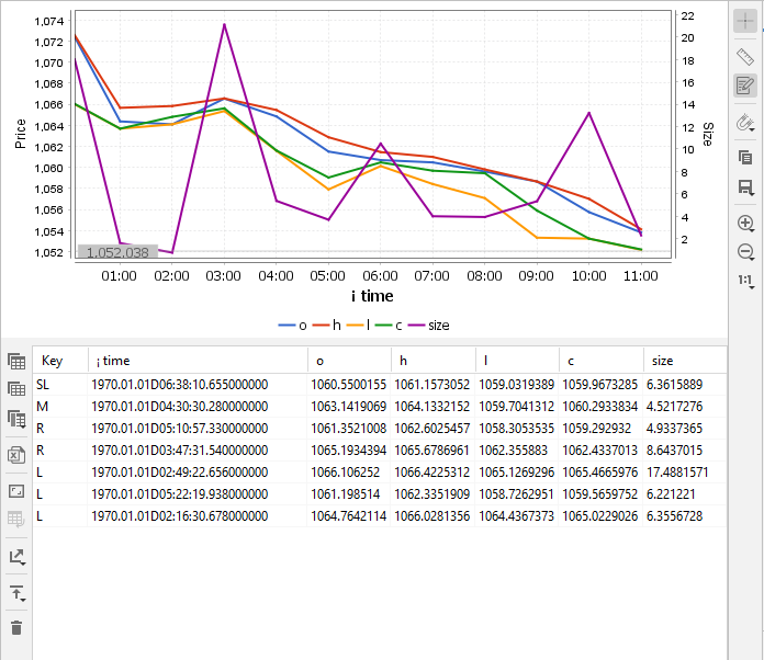
The Key column contains pressed button market and modifier key, if pressed:
- L - left button
- R - right button
- M - middle button
- S? - click with shift pressed
- C? - click with ctrl pressed
- CS? - cick with shift and ctrl pressed
Using the market, you can collect many point into one table at the same table. For example, by pressing left button for high prices and right for low prices.
Snapping
By default, any other charting tools are free-formed and can show any point on the chart, but sometimes real data is required, and it’s exactly where snapping can help:
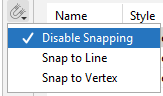
You can snap mouse movement to line only, and you can select any point on X axis, but Y will always be auto-connected to the chart line:
You can snap mouse movement to line only, and you can select any point on X axis, but Y will always be auto-connected to the chart line:
or you can use stronger snapping and bind X axis to chart points as well:
Export Image
You can copy and save the chart with appropriate tools in SVG or PNG formats if required. Nothing special here